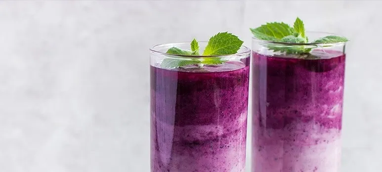
Red and pink beverages are visually unforgiving. A small shift can make a berry drink look brown, turn a bright pink into purple, or leave a formerly vibrant product looking washed out after a few weeks on the shelf. The challenge becomes greater when the brand is moving away from synthetic dyes.
Successful reformulation starts with the beverage itself. Acidity, pasteurization, light exposure, flavor system, and packaging all influence the final appearance. A color choice made in plain water is only the first screen, not the final answer.
Map the Beverage Before Picking the Pigment
Write down the pH range, processing temperature, hold time, package type, and expected distribution conditions. A refrigerated juice in an opaque bottle faces a different environment from a shelf-stable drink in clear PET.
This information helps suppliers recommend candidates and helps R&D design relevant tests. It also prevents the team from rejecting a useful pigment because it was evaluated under conditions the finished beverage will never experience.
Beet Can Deliver Bright Pink-Red Tones
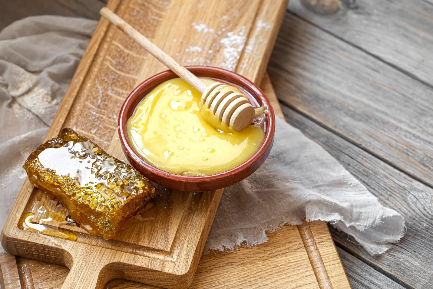
Depending on concentration and matrix, Beetroot Colour can create vivid pink-to-red shades. Its betalain pigments, however, need to be evaluated against the beverage’s heat exposure, light, oxygen, and shelf-life expectations.
Beet-derived systems can also carry sensory considerations at higher use levels. If the target shade demands more color than the flavor system can tolerate, changing the formulation format or blending color sources may be more effective than simply increasing dosage.
Acidity Changes What the Consumer Sees
Many beverage pigments respond strongly to pH. Even when a source remains usable across the target range, small shifts can change hue or intensity enough to matter on shelf. That makes pH control part of color control.
When selecting food coloring for drinks, developers should test the actual acid system rather than a generic laboratory buffer. Citric, malic, phosphoric, and fruit acids can appear in different beverage styles, and the rest of the formula can change the visual result.
Heat and Filling Conditions Need Real Trials
Short-time pasteurization, hot filling, tunnel pasteurization, and retort are not equivalent stresses. A pigment that survives one may not keep the same shade through another. The container can continue holding heat after filling, extending exposure beyond the kettle.
Create samples through the actual time-temperature profile whenever possible. Measure or photograph the drink before processing, after cooling, and during storage. That timeline reveals whether the main change happens during heat or later on the shelf.
Packaging Can Protect or Expose the Shade
Clear bottles put the product on display, but they also expose sensitive pigments to light. Sleeves, labels, tinted packaging, and secondary cartons can reduce that stress. Packaging design therefore belongs in color discussions earlier than many teams expect.
Run shelf tests in the actual package, not only glass lab bottles. Headspace oxygen, closure type, and package light transmission may change stability. A formula that looks excellent in a protected sample can behave differently in commercial presentation.
Keep Flavor and Color Development Connected
Consumers associate color with flavor before tasting. A bright red drink may suggest strawberry, cherry, or fruit punch; a purple-red tone may imply berry or grape. If the shade shifts, the flavor can feel less convincing even when the formula itself has not changed.
Sensory panels should therefore see the product as it will be sold. Blind flavor testing is useful for some questions, but final validation should include the real color and package. The visual cue is part of the drinking experience.
Set an Acceptable Shade Window Before Launch
No beverage line reproduces color with absolute mathematical sameness. Fruit solids, pH, processing time, and normal ingredient variation can move the appearance slightly from batch to batch.
A practical specification defines how much movement is acceptable. Retained standards or instrumental color values help production judge a batch consistently and prevent unnecessary corrections that may actually create larger shade swings.
Conclusion
A stable pink-to-red beverage comes from matching pigment chemistry to acidity, heat, packaging, and flavor rather than correcting the shade at the end. The most useful trials reproduce the full process and follow the product through storage.
Beverage teams can explore plant-based color options and formulation support at foodrgb.com. Starting with the real matrix, then testing processing and package effects, gives a reformulation a better chance of looking consistent from the first production day to the end of shelf life.